ROLE Brand Design
CLIENT Encore, 2018
STUDIO Airlift
A brand concept for Arla, an up-and-coming housing community nestled in the Eagle Rock neighbourhood of Los Angeles. Arla represents a movement characterised by simple and functional living, and influenced by Scandinavian home life. The client approached us to design an identity that combined the timeless simplicity of Nordic design with the warmth and “wellness” of Los Angeles.
ROLE Brand Design
CLIENT Encore, 2018
STUDIO Airlift
A brand concept for Arla, an up-and-coming housing community nestled in the Eagle Rock neighbourhood of Los Angeles. Arla represents a movement characterised by simple and functional living, and influenced by Scandinavian home life. The client approached us to design an identity that combined the timeless simplicity of Nordic design with the warmth and “wellness” culture of Los Angeles.
ROLE Brand Design
CLIENT Encore, 2018
STUDIO Airlift
A brand concept for Arla, an up-and-coming housing community nestled in the Eagle Rock neighbourhood of Los Angeles. Arla represents a movement characterised by simple and functional living, and influenced by Scandinavian home life. The client approached us to design an identity that combined the timeless simplicity of Nordic design with the warmth and “wellness” culture of Los Angeles.
ROLE Brand Design
CLIENT Encore, 2018
STUDIO Airlift
A brand concept for Arla, an up-and-coming housing community nestled in the Eagle Rock neighbourhood of Los Angeles. Arla represents a movement characterised by simple and functional living, and influenced by Scandinavian home life. The client approached us to design an identity that combined the timeless simplicity of Nordic design with the warmth and “wellness” culture of Los Angeles.
ROLE
Brand Design
CLIENT
Encore, 2018
STUDIO
Airlift
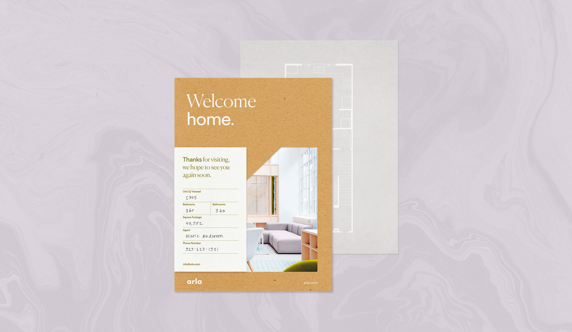
A brand concept for Arla, an up-and-coming housing community nestled in the Eagle Rock neighbourhood of Los Angeles. Arla represents a movement characterised by simple and functional living, and influenced by Scandinavian home life. The client approached us to design an identity that combined the timeless simplicity of Nordic design with the warmth and “wellness” culture of Los Angeles.
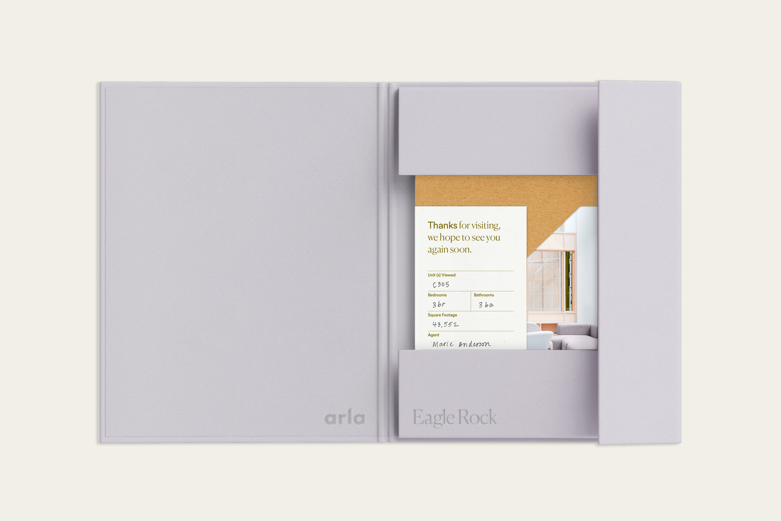
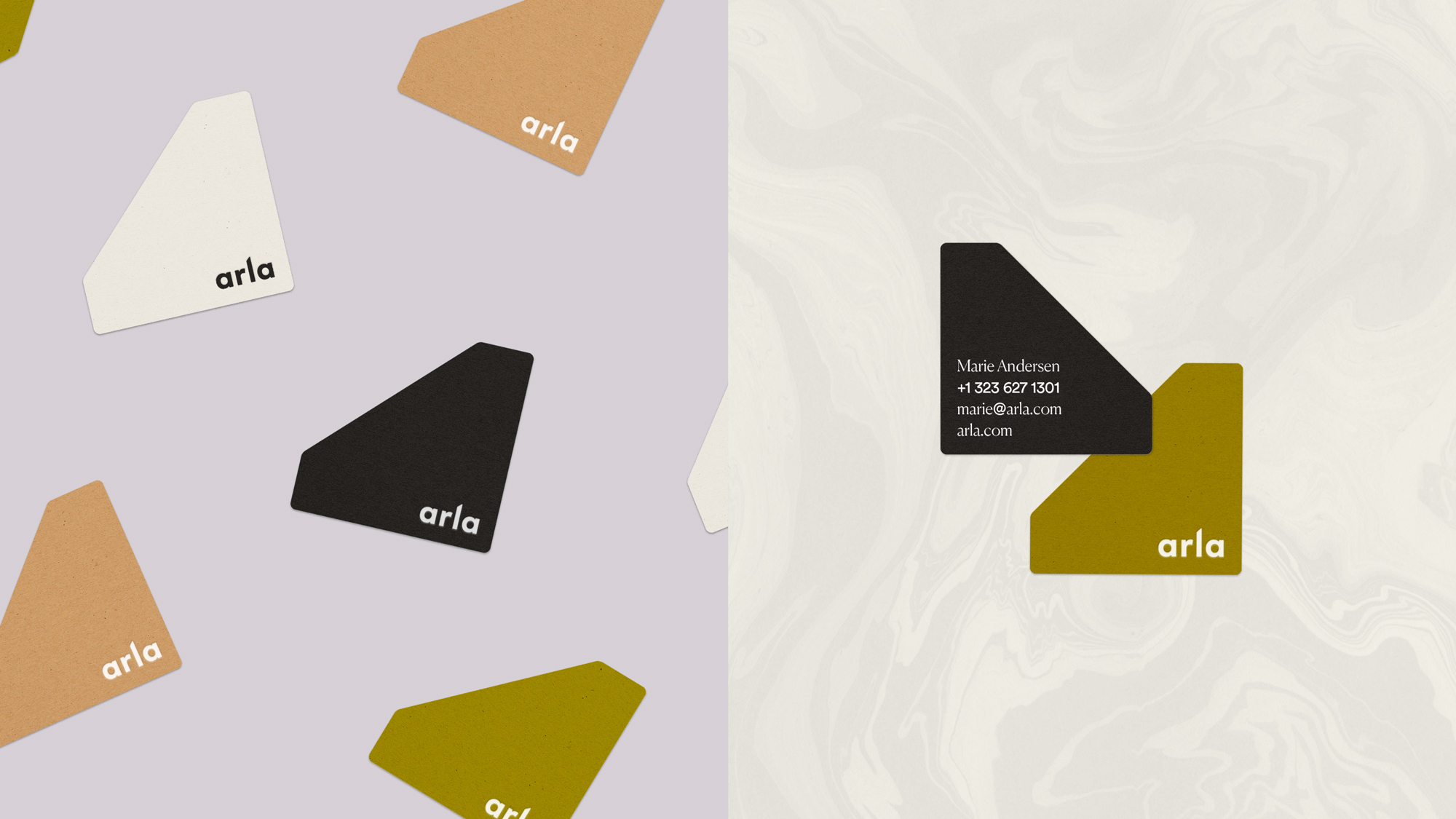
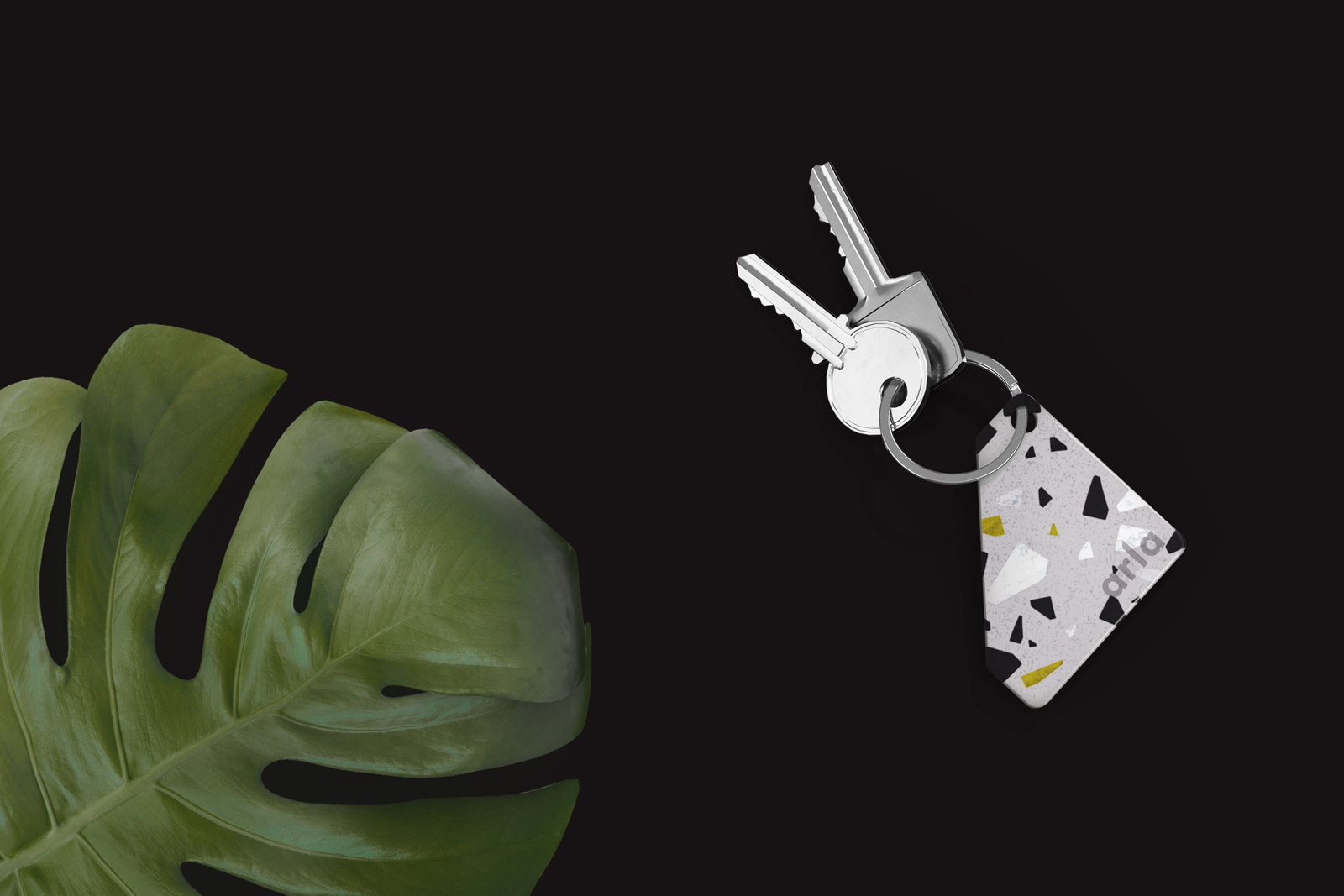
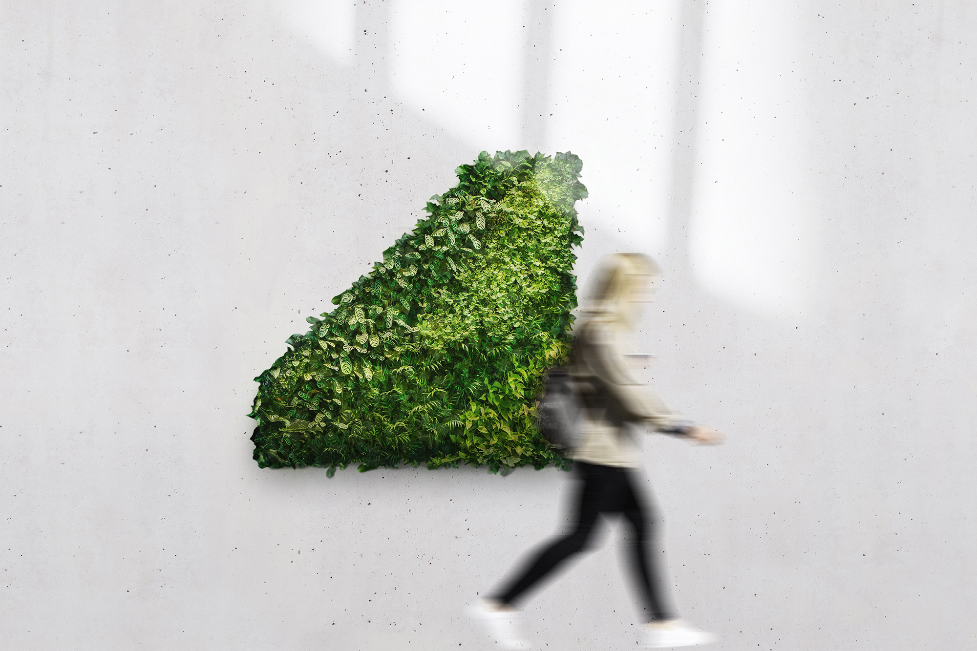
This direction finds its form in natural elements and architectural details. The logo mark, or the “frame of life,” is informed by the shape of Arla’s characteristically sloping rooftops. The same sloped angle is also found in the word mark. The clean and geometric typographic style feels both friendly and sleek, and is inspired by the typography of classic Scandinavian design brands known for their minimalism and elegance. Earthy tones and organic textures mirror the tones of the buildings, the plants in the community, and the various materials found in each unit.
This direction finds its form in natural elements and architectural details. The logo mark, or the “frame of life,” is informed by the shape of Arla’s characteristically sloping rooftops. The same sloped angle is also found in the word mark. The clean and geometric typographic style feels both friendly and sleek, and is inspired by the typography of classic Scandinavian design brands known for their minimalism and elegance. Earthy tones and organic textures mirror the tones of the buildings, the plants in the community, and the various materials found in each unit.
This direction finds its form in natural elements and architectural details. The logo mark, or the “frame of life,” is informed by the shape of Arla’s characteristically sloping rooftops. The same sloped angle is also found in the word mark. The clean and geometric typographic style feels both friendly and sleek, and is inspired by the typography of classic Scandinavian design brands known for their minimalism and elegance. Earthy tones and organic textures mirror the tones of the buildings, the plants in the community, and the various materials found in each unit.
This direction finds its form in natural elements and architectural details. The logo mark, or the “frame of life,” is informed by the shape of Arla’s characteristically sloping rooftops. The same sloped angle is also found in the word mark. The clean and geometric typographic style feels both friendly and sleek, and is inspired by the typography of classic Scandinavian design brands known for their minimalism and elegance. Earthy tones and organic textures mirror the tones of the buildings, the plants in the community, and the various materials found in each unit.
This direction finds its form in natural elements and architectural details. The logo mark, or the “frame of life,” is informed by the shape of Arla’s characteristically sloping rooftops. The same sloped angle is also found in the word mark. The clean and geometric typographic style feels both friendly and sleek, and is inspired by the typography of classic Scandinavian design brands known for their minimalism and elegance. Earthy tones and organic textures mirror the tones of the buildings, the plants in the community, and the various materials found in each unit.